
Sneak Peek
Overview
Problem
How do we create a new way to help motorcycle riders navigate safely without distractions in all weather conditions.
Solution
Wing - a detachable head up display (HUD) unit for helmets that displays navigational information adaptively to help riders commute safely.
My Role
Industrial Design: Sketched and digitally modeled concepts for 3D printing
Interface Design: Created medium fidelity sketch concepts, designed high fidelity mockups for user testing, animated high fidelity interface elements and created a video to demonstrate the interface in action.
UX Research: Conducted interviews, designed surveys, and tested the physical and digital components of the product.
Team
Leonardo Hummel
Varun Nambiar
Timeline
8 weeks
Tools
Fusion 360
Keyshot
Sketch
AfterEffects
Context and Problem
The options available to help with navigation on a motorcycle are very limited. A few companies have tried, and for the most part failed, to penetrate the market with smart helmet technologies. Today, most riders use handlebar mounts and use their phones to navigate, but this becomes a problem in poor weather conditions.
Having personally faced all of the challenges that come with the use of GPS in a vehicle without a roof, Leo and I wanted to explore this space and figure out a solution to this problem. Over the course of 8 weeks, we conducted primary research into the space to understand all the problems riders faced, and then designed and fabricated a product that could be used to solve the problems. To succeed, we were required to create a robust project plan, set achievable goals, and execute the tasks within extremely tight windows. We worked together as a cohesive unit to maximize the work output by utilizing our strengths effectively.
Design Process
Design
Research
Inception
Interviews
Market Research
Pain Points
Personas
Hardware Design
Space Visualization
Form Ideation
Head Scan
Prototyping
Interface Design
Defining Visual Content
Determine Interaction Level
Minimize Cognitive Load
User Testing
Wing v1.0
Research
Interviews
We began the discovery process by visiting Brother Moto - a community based DIY garage for motorcyclists. A deep dive into the space started through conversations with experienced motorcycle riders. Although both Leo and I ride, we didn't want our biases to influence our designs.
We had the chance to speak with a total of 8 members in a group setting to discuss how they navigate while commuting on a motorcycle.

I noted all of the pain points mentioned during the interview, with some notable quotes mentioned below. Unfortunately none of the users I had the chance to speak with had prior experience with smart helmets, and their mode of navigation was via a phone app.
"I can't use GPS on my phone when it's cold or raining"
"I need to memorize directions before I go on a ride"
"I write directions on a piece of paper and stick it to the tank"
"Google Maps has too much information for me to process quickly"
Pain Points
-
Mounting a phone on the handlebar for navigation only works in good weather conditions.
-
Having to look down at the phone screen temporarily disengages riders from their surroundings.
-
Most motorcycle gloves make it difficult to operate touch screen phones.
-
Phone navigation apps are not optimized for riders, and give too much information for the riders to sift through.
-
Most riders wear earplugs while riding, limiting audio feedback options.
Competitive Analysis
To explore the current market for motorcycle HUDs, we looked at the three biggest products in this space - the Skully Fenix AR helmet, the Nuviz HUD and the Jarvish X-AR helmet. We looked at what the reviewers as well as long time users said to understand what worked and what didn't.

Skully Fenix AR
$1,899
Review
AR technology inbuilt into helmet
No aerodynamic impact since electronics are housed inside
Not SNELL safety rated

Nuviz External HUD
$700
Review
External attachment
Aerodynamic Impact due to external geometry
Handlebar mounted controls

Jarvish X-AR
$1,599
Review
AR technology inbuilt into helmet
No aerodynamic impact since electronics are housed inside
Not SNELL safety rated
Learnings
-
Riders who purchase mid to high end helmets (> $300) are particular about safety standards, and expect SNELL certification.
-
The Fenix and X-AR are only DOT certified, which is the most basic safety rating.
-
The externally mounted Nuviz HUD impacts aerodynamics at high speeds.
-
All three products have unintuitive interfaces that rely on frequent user inputs and display an overwhelming amount of information.
Research Synthesis
With the research we did so far, we saw an opportunity to design a product that could tackle some of the pains users feel today. We used the following constraints to guide our design process going forward.
Hardware Design
-
Must be weather resistant
-
Must not affect aerodynamics
-
Must be usable with gloves
-
Must be compatible with most, if not all full face helmets
Interface Design
-
Must not be distracting
-
Must require minimal user input
-
Must not obstruct field of view
-
Must be highly accessible to all user groups
Personas
To help guide our designs during the concept development stage,
I used the information we learned and came up with two personas.

Chris, 26
Commutes daily to and from work on a sports bike
Needs
-
Navigation assistance when exploring new areas in the city
-
Low cost GPS product/service
Frustrations
-
Afraid of taking eyes off the road to look at the phone in traffic
-
Phone becomes unresponsive when used in the winter

Jacob, 42
Rides his Harley on weekends with his buddies
Needs
-
A simple and intuitive navigation experience
-
Hands free experience
Frustrations
-
Can't interact with phone with gloves on
-
Does not want his riding experience diminished with overwhelming tech
Hardware Design
Hardware Product Development
Our Approach
Through our research, we determined that one of the possible solutions that would address the problem is a HUD that sits inside the helmet. Inspired by the smart AR helmets, we wanted to design a HUD that would tackle a lot of the competitors' shortcomings. We specifically wanted to address the following.

Internally mounted device that can fit on most full face helmets
Have little to no
aerodynamic impact
Minimal field of view
obstruction
Operable with
motorcycle gloves
Hardware Design Process
Technology Exploration
Lo-Fidelity Prototyping,
Testing
Form
Development
High Fidelity Prototyping,
Testing
Technology Exploration
Our first step was to understand what could be made possible with the current state of technology. We looked into various HUD and AR devices, looked at various applications from airplanes and cars to goggles used in extreme sports. We spent an afternoon playing with a Google Glass to learn about how Near-Eye Displays look and feel in person. Although physically small in size, this display projects a screen that appears quite large. This had an influence on both, the physical and interface design.

Lo-Fidelity Prototyping and Testing
Leo prototyped two rigs and laser cut a variety of acrylic screens in different shapes and sizes to test the optimum location for the HUD to sit.


The frames were designed to wedge itself inside the helmet, and the various screens and attachment points allowed us to test placement in every quadrant of the rider's field of view.


Review
-
Tested prototypes with 9 users.
-
Personally tested all prototypes on road.
-
7 users preferred screen location in upper right quadrant as it doesn't obstruct view of oncoming traffic.
-
6 users wanted smallest possible screen size to minimize visual distraction.
Form Development
To better understand the complex interior space between the rider's head and the helmet visor, we 3D scanned a user wearing a helmet. We used the scan as a reference to help sketch out concepts on paper as well as during the CAD process.


I sketched out various concepts on paper to help us visualize different forms.

We designed a detachable HUD that magnetically snaps to the helmet via a mount.
Design Decisions
-
2 piece design consisting of a base and a mount
-
Mount stays fixed on helmet's upper lining
-
Magnetic attachment between base and mount
-
Minimize mount thickness
-
Screen position in upper right quadrant
-
Operable with motorcycle gloves
High Fidelity Prototyping
Using the head scan from earlier as a reference, I modeled various iterations of the concept in Fusion 360 and sent them to Leo, who 3D printed them for testing. I worked on the form while collaborating with him on setting the right tolerances and be able to print well for testing.

Using a combination of PLA and TPU materials, we 3D printed and tested 11 prototypes.

We tested the prototype in various riding positions to ensure optimum visibility of the HUD.


Review
-
Adjusted various parameters with each prototype to minimize visual obstruction as much as possible and making the screen placement more favorable.
-
Tested prototypes with 5 users.
-
Users liked that the HUD was detachable.
-
Users reported that the screen location and size was optimal.
-
Users liked not having to physically interact with it after attaching to the mount.
Interface Design
Interface Development
Approach
Unlike traditional digital UI, designing for a HUD proved to be challenging because of the unique use case and the number of limitations. Based on the prior research, we were guided by the following questions.
"What is the optimum amount of content to be displayed?"
"How could we deliver the content in a non intrusive way?"
"How could we draw attention without it becoming a distraction?"
Interface Design Process
Information
Prioritization
Information Delivery
Visual Design
Development
Information Prioritization
We referred to Google Maps and Waze to identify all the various elements they currently show during navigation. I listed these out and sent out a survey, asking users to rank the importance on a 5 point scale. 14 users responded to the survey, and we averaged the results below.
We used the findings to prioritize the critical information needed to successfully navigate without unnecessary elements causing distraction.
Level of Importance
Not at all
important
Slightly
important
Neutral
Moderately
important
Very
important
Visual Map
Turn by Turn
Current Street Name
Street Name at POI
Current Time of Day
Elapsed Ride Time
Time to POI
Elapsed Mileage
Nearby POIs
Time of Arrival
Distance to POI
Note: POI is short for Point of Interest
Critical Information
-
Turn by Turn
-
Distance to Point of Interest (POI)
-
Street Name at POI
-
Time of Arrival and Time of Day
Adaptive Information Delivery
We now needed to decide when to show the information. The goal was to minimize on-screen content so as to prevent distractions, but also give enough information to the rider for them to navigate comfortably. Due to logistical reasons we couldn't actually test this with users while they rode, so we played a first person view video of the rider and tried to work out the information needed at different stages from the point of interest (POI).
Distance to Point of Interest
Information
Displayed
Attention
Level
Desired
Outcome
>
1
mi
Distance to POI
Time of Arrival
Time of Day
Low
User is given information at a glance
1000
ft
-
1
mi
Distance to POI
Low
User is alerted about an upcoming POI
250
ft
-
1000
ft
Distance to POI
Street Name
Medium
User is expected to get into the correct lane
<
250
ft
Street Name
High
User makes the turn
Visual Design Development
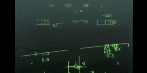
We prioritized functionality for the visual design. I took inspiration from fighter jet HUDs to design the visual assets. We used green because the human eye is most sensitive to that color. The HUD would need be easily readable and legible regardless of time of day or weather conditions.
Using the principles of visual hierarchy, I mocked up different interfaces while carefully considering layouts, element sizes, weights, and typography.

Since animation plays a big role in this interface, I mocked up various examples in AfterEffects to better visualize it.
Information at a glance
Subtle, non intrusive animations
Alert rider about upcoming turn
Dynamically updates hierarchy of elements
Gentle, low frequency strobe
High frequency strobe on approach
Product Inception
Wing
Our prototype and testing led us to the first version of Wing. It is designed as a two-piece device consisting of the HUD unit and a mount. The mount permanently attaches to the inner lining of the helmet with a strip of 3M VHB tape. The slim, low-profile construction takes up virtually no space in the rider's field of view when the HUD is not in use. The HUD magnetically snaps onto the mount, allowing it to be easily attached/detached. A textured, rubberized material makes it easy to grip.

Here is an interactive model of the prototype.
The slim profile of the mount takes up virtually no space in the rider's field of view.


How It Works
The internals consist of a battery, which powers a screen that displays the feed through a planoconvex lens and a reflector, allowing the projection to fall on the transparent glass. Using similar components to the Google Glass in conjunction with a planoconvex lens allows a larger projection distance for the digital elements to be in focus at all times.

A single button interaction makes it easy to pair the HUD to a smartphone. A large physical button makes it accessible even with gloves on.


To demonstrate what it would look like, I made a video in AfterEffects to show how the HUD assists the rider in making a right turn about half a mile from their position.
Future Considerations
Moving forward, we would like to explore the companion phone app and make considerations as to how the interactions with the HUD would influence the design and features of the application.
Given the time and resources, the next step would be to create a working prototype of the HUD. Although we didn't have the time to build this, we based the form around physical constraints that would allow for the technology to sit within. Most of the physical and digital design decisions we made were informed by our research and we are confident that a product like this could be successful.
Our vision with this project was to design a new, safe way for motorcycle riders to navigate, and we believe Wing could make that a possibility.